19 Phasor Plot
Phasor Plot displays a matching pair of first- or second-harmonic phasor coordinates against the universal semicircle. Use it to compare the positions and spread of groups measured with the Lifetime fit free extractor, or from a user table with the expected coordinate names.
After a dataset is loaded, Phasor Plot is hidden from the Bivariate method selector if the dataset has no recognized, complete G/S coordinate pair. A pair must belong to the same channel and harmonic, and both columns must be numerical. See coordinate names and column roles below.
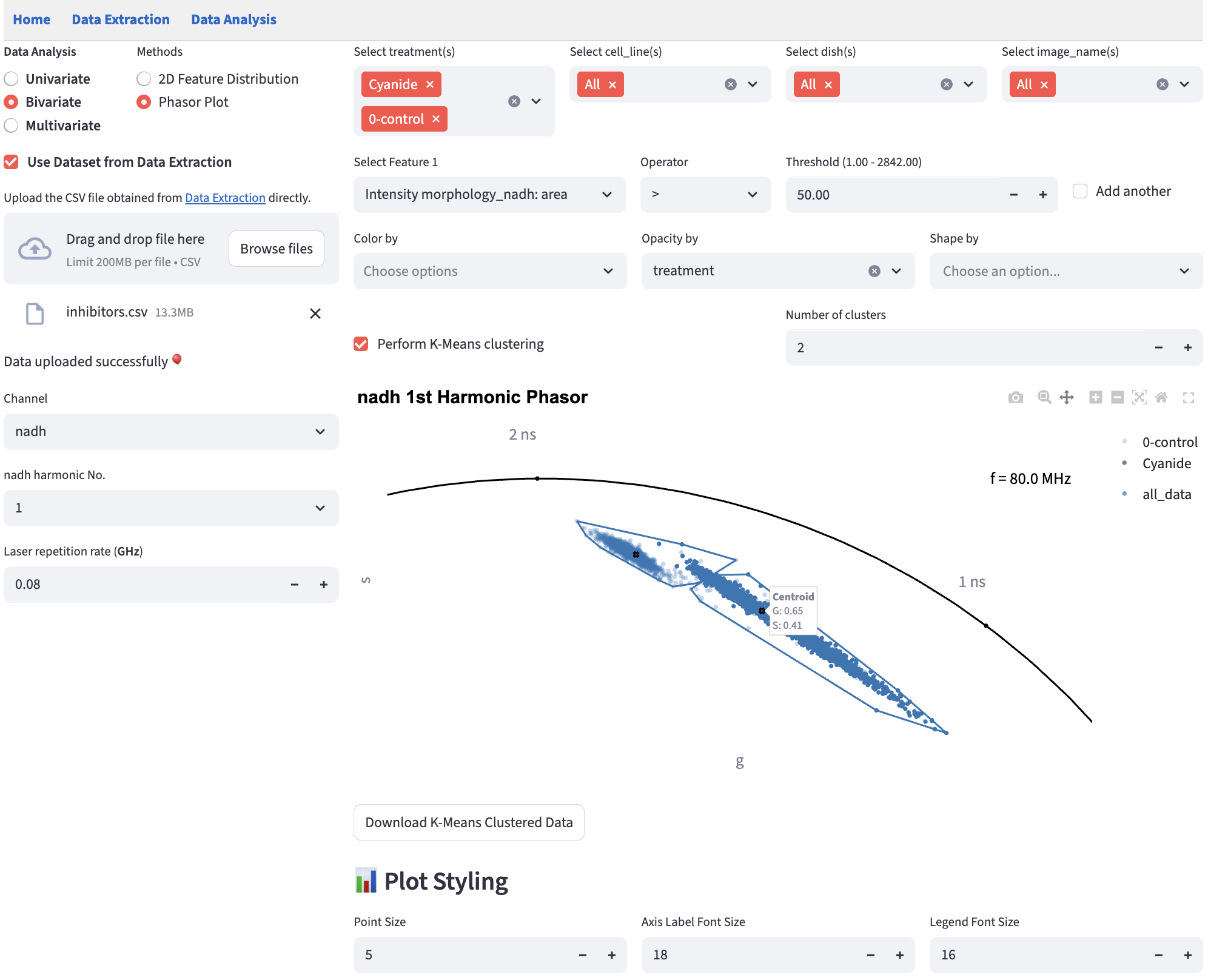
19.2 Select Phasor Coordinate
On the left, select Channel when more than one channel is present, then choose its harmonic No. Only harmonics with both G and S coordinates are offered. A table containing just one complete harmonic pair can still use Phasor Plot.
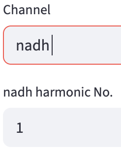
The method recognizes numerical columns named Lifetime fit free_{channel}: G(1st) and Lifetime fit free_{channel}: S(1st), or their G(2nd) and S(2nd) counterparts. For example, a first-harmonic NADH pair is Lifetime fit free_nadh: G(1st) and Lifetime fit free_nadh: S(1st). In a user-table review, assign both columns Numerical; they may belong to different feature groups. After upload, Phasor Plot is available only if the table contains a complete pair.
Set Laser repetition rate (MHz) to the acquisition’s base repetition rate, for example 80 for 80 MHz. This controls the lifetime reference markers; it does not recalculate or calibrate the uploaded coordinates. The app removes rows missing either coordinate from the displayed plot.
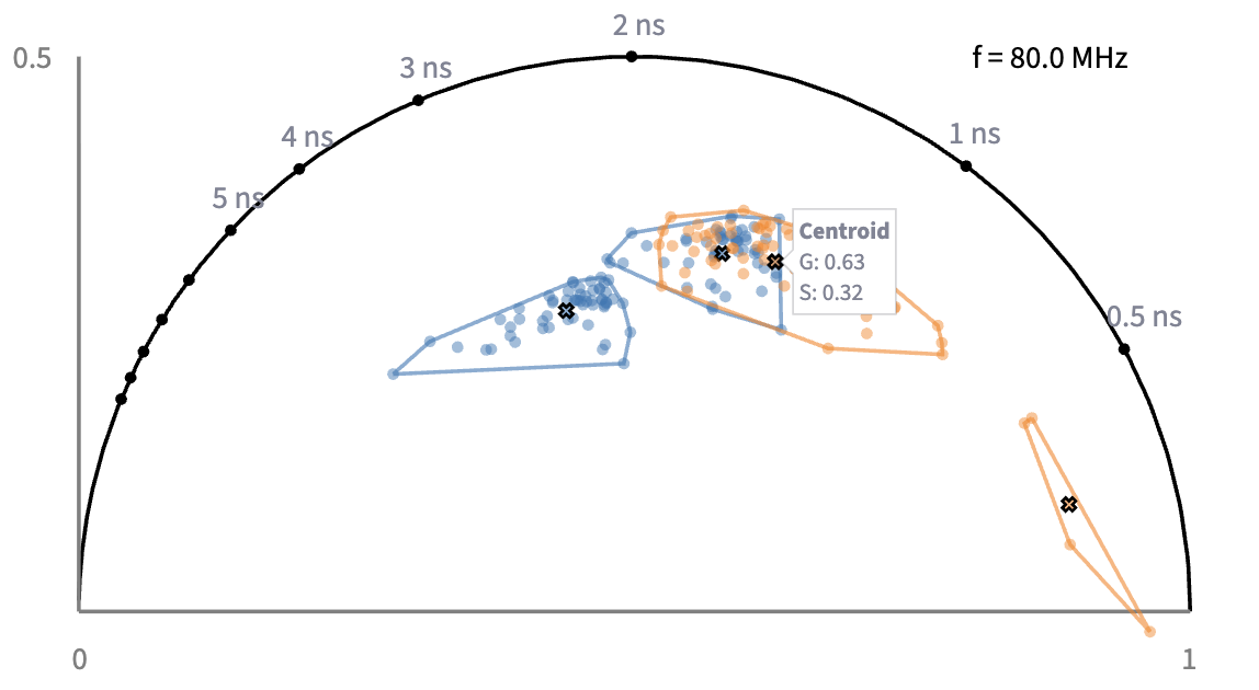
The plot is drawn against the universal semicircle, with markers along it for lifetimes from 0.5 to 10 ns to read your points against. Switching to the 2nd harmonic moves those markers, because the transform is evaluated at twice the frequency and a given lifetime lands somewhere else. The frequency printed inside the plot tells you which view you are reading — f = 160 MHz (2 × 80 MHz) for the 2nd harmonic of an 80 MHz system — so check it before comparing a point against a marker. The semicircle itself is the same for both harmonics.
19.3 Separate by

Choose cell_line in Separate by and treatment in Color by, then select a cell line above the plot. For example, select Panc1 to highlight its treatments while keeping MCF7 observations in gray for context. The selected category keeps its color, opacity, and shape encodings; observations from other categories remain visible as faint gray context points. The full-size axes and lifetime references remain the same as you switch categories.
The separation column cannot also be used for Color by. Point colors stay consistent across categories, and Show group counts (n) in legend counts only the selected category’s complete G/S observations. Gray context points do not contribute to those counts or provide individual hover labels.
19.4 Export the plot
Click Export the entire analysis as a Python script below Plot Styling to reproduce the current channel, harmonic, repetition rate, filters, encodings, and selected category. Follow the shared script workflow to generate an SVG figure from the original table.