16 Feature Distribution
This method extends the univariate Feature Histogram method to visualize the distribution of two numerical features on a scatter plot. It helps reveal patterns such as correlations, clusters, trends, or outliers.
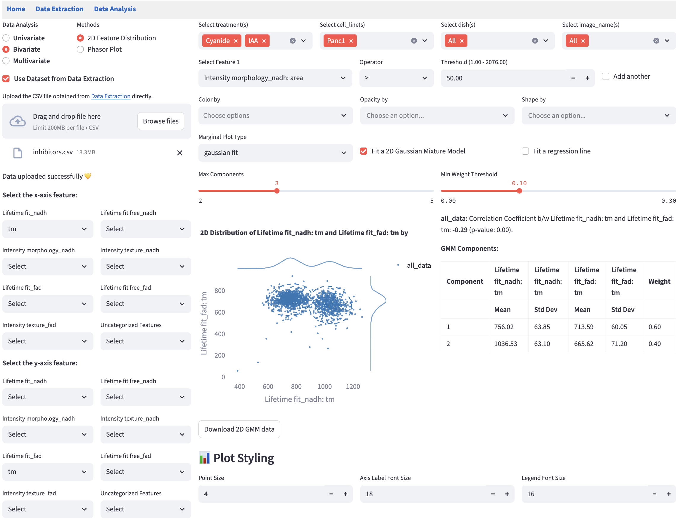
16.2 Marginal Distribution
Marginal distributions (the distribution of a single feature) are plotted at the top and the right of the scatter plot. Users can choose the plot type from the dropdown menu.
gaussian fit: provides a kernel-density estimate using Gaussian kernels. It uses gaussian_kde from scipy.stats and sets all parameters to default values.
16.3 2D Gaussian Mixture Model
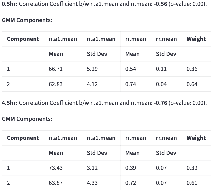
Using the same method as fitting a 1D Gaussian Mixture Model, users can fit a 2D GMM by specifying Max Components and Min Weight Threshold for each color group.
Ellipses that capture approximately 95% of the points in each subcomponent are drawn. The color of the ellipses is determined by the color group that the subcomponent belongs to.
Each ellipse represents a subcomponent of the GMM.
Center of the ellipse is the mean of the subcomponent (\(\mu_x, \mu_y\)).
The ellipse is rotated by \(\theta = \arctan2\!\left(v_{1y}, v_{1x} \right)\), where \(\mathbf{v}_1 = \begin{bmatrix} v_{1x} \\ v_{1y} \end{bmatrix}\) is the first eigenvector of the covariance matrix, so that the major axis of the ellipse is aligned with the eigenvector corresponding to the largest eigenvalue.
The semi-axis lengths are \(r\sqrt{\lambda_1}\) and \(r\sqrt{\lambda_2}\), where \(\lambda_1\) and \(\lambda_2\) are the covariance eigenvalues (variances along the principal axes) scaled by \(r = \sqrt{\chi^2_{\,\mathrm{df}=2,\,p=0.95}}\) (Mahalanobis distance) that captures approximately 95% of the points in the subcomponent.
All the components below will be rendered for each color group, which is created by user-chosen categorical features in Color by.
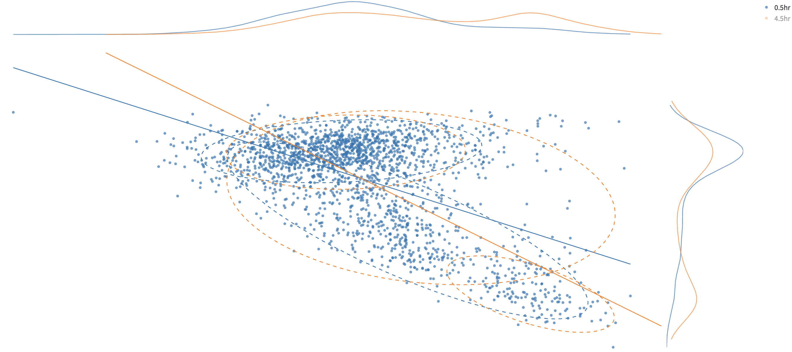
Users can click on a legend group to hide/show the data points in that group. In the above example, to avoid cluttering the plot, the orange group is hidden.
Tables of subcomponents’ means, standard deviations, and weights are reported on the side.
The classification result can be saved by clicking:

The classification is done by hard assignment to determine which GMM component each data point belongs to. It appends a new categorical feature column called 2D_GMM_group to the filtered dataset, the values of which are {color_group}_group1, {color_group}_group2, etc. The downloaded dataset keeps all the features plus the new categorical feature column, which is recognized by any method in Data Analysis as a categorical feature like others. The rows that pass the filters are included.
16.4 Regression line
A linear regression line is fitted to the data points in each color group. The key statistics are reported on the side.

\(R^{2}\) tells how much of the variability in \(y\) is captured by the model, compared to just predicting the \(\bar{y}\).
- \(R^{2} = 1\) → perfect prediction.
- \(R^{2} = 0\) → model predicts no better than the mean.