16 Feature Comparison
This method allows users to compare the distributions of a single numerical feature across groups. It can help users spot overarching trends between distributions, identify within-distribution shape-related characteristics such as skewness or bimodality that might signal sub-populations, and diagnose potential outliers.
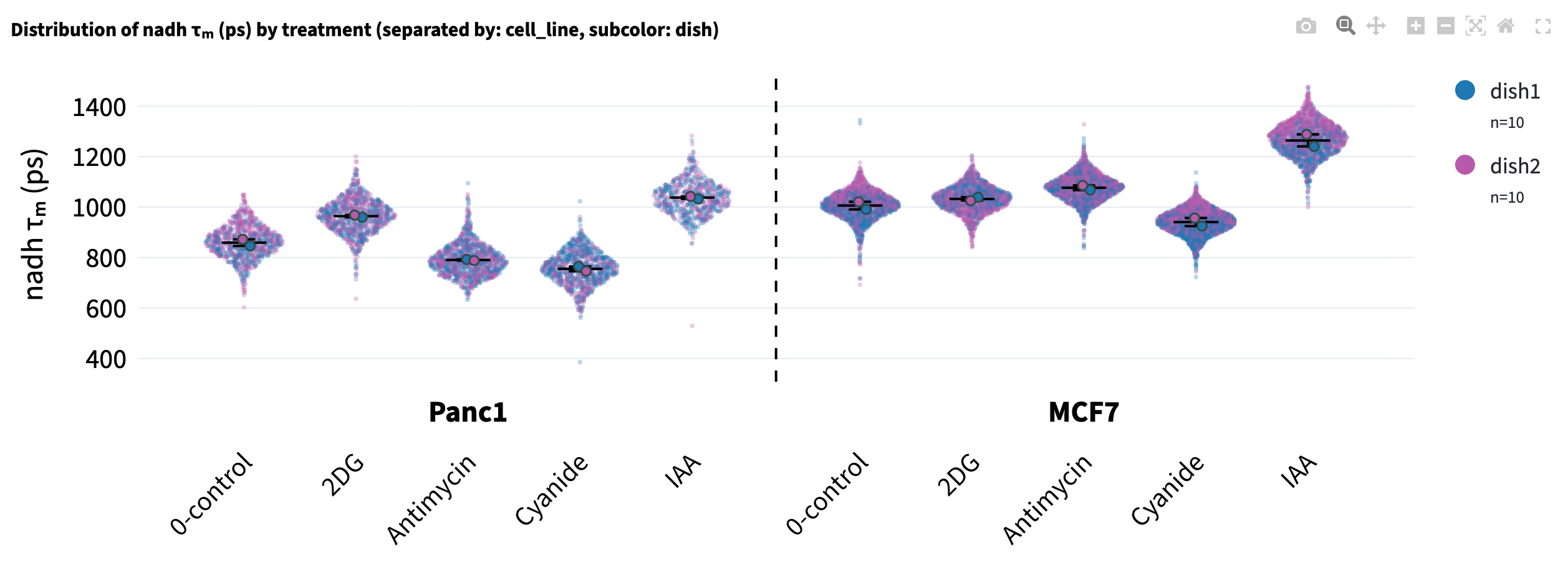
To keep the point-based visualization style that supports interactive hover while showing the violin-plot-like distribution, Sina plot is used: it uses gaussian_kde from scipy.stats to make sure the width of the point distribution is proportional to the kernel density.
The spread is computed per group on the x-axis, so Shape by, Opacity by and Subcolor by change how a point looks, not where it sits.
16.2 Plot Options
Above the plot, use Log Y, Overlay, and Connect means to control the display:
- Log Y: transforms the selected feature with \(\log_{10}(x + 10^{-6})\) before plotting and calculating summaries and comparisons. The small offset allows zero values; the axis label becomes \(\log_{10}(\ldots)\). If negative values are present, the app reports an error and keeps the original scale. With
Collapse by, it averages first and then transforms the category means. - Overlay → Boxplot: overlays a box-and-whisker summary on each group. The box spans the interquartile range (\(Q_1\)–\(Q_3\)) with the median as a solid line and the mean as a dashed line; the whiskers follow the Tukey definition at \(Q_1 - 1.5 \times \text{IQR}\) and \(Q_3 + 1.5 \times \text{IQR}\), bounded by the data range. Choose
Noneto show the points without an overlay. SelectingCollapse byalso makesSuperPlotavailable. - Connect means: draws a line connecting the mean of each group (within each section when
Separate byis used), which can help reveal trends across ordered groups.
16.3 Collapse by
Choose a categorical column in Collapse by, such as dish, patient, or image_name, to replace individual observations with one mean per category within each displayed group. The app first applies the filters and removes rows missing the selected measurement. It then averages the measurement separately for every combination of the selected collapse category, Color by / Group by, and Separate by. A dish represented in two treatments therefore contributes one point to each treatment.
The boxplot, connected means, effect sizes, and statistical tests now use these category means. Each point has equal weight in its displayed group’s mean, regardless of how many observations were averaged into it. Selecting a collapse column keeps the existing x-axis groups and sections. A column already used for either grouping control is unavailable in Collapse by.
Collapse changes the analysis unit, but the supported t-tests still assume independent samples. The app does not pair observations across groups, even when the same dish or patient appears in several groups.
Hover over a category mean to see its label and contributing observation count, such as dish1 (n=1874). Show group counts (n) in legend counts category means after collapse. If a point-encoding column varies within any group being averaged, the app turns that encoding off and explains why; using the collapse column itself for Subcolor, Opacity, or Shape keeps it available.
16.3.1 SuperPlot
After selecting Collapse by, choose Overlay → SuperPlot to show the original observations as smaller, fainter points behind the category means. The larger points remain the category means, and each displayed group receives a mean bar with ± one standard error of the mean (SEM), calculated across those category means. A group with only one category mean still has a mean bar, but its SEM is undefined.

The original observations provide context while all comparisons continue to use category means. Hovering over a small point shows its individual identifier; hovering over a large point shows the category and its observation count. Legend counts still count category means. With Log Y, the small points are transformed individually and the larger points are transformed after averaging, so a large point need not equal the mean of the small points on the transformed scale.
16.4 Separate by
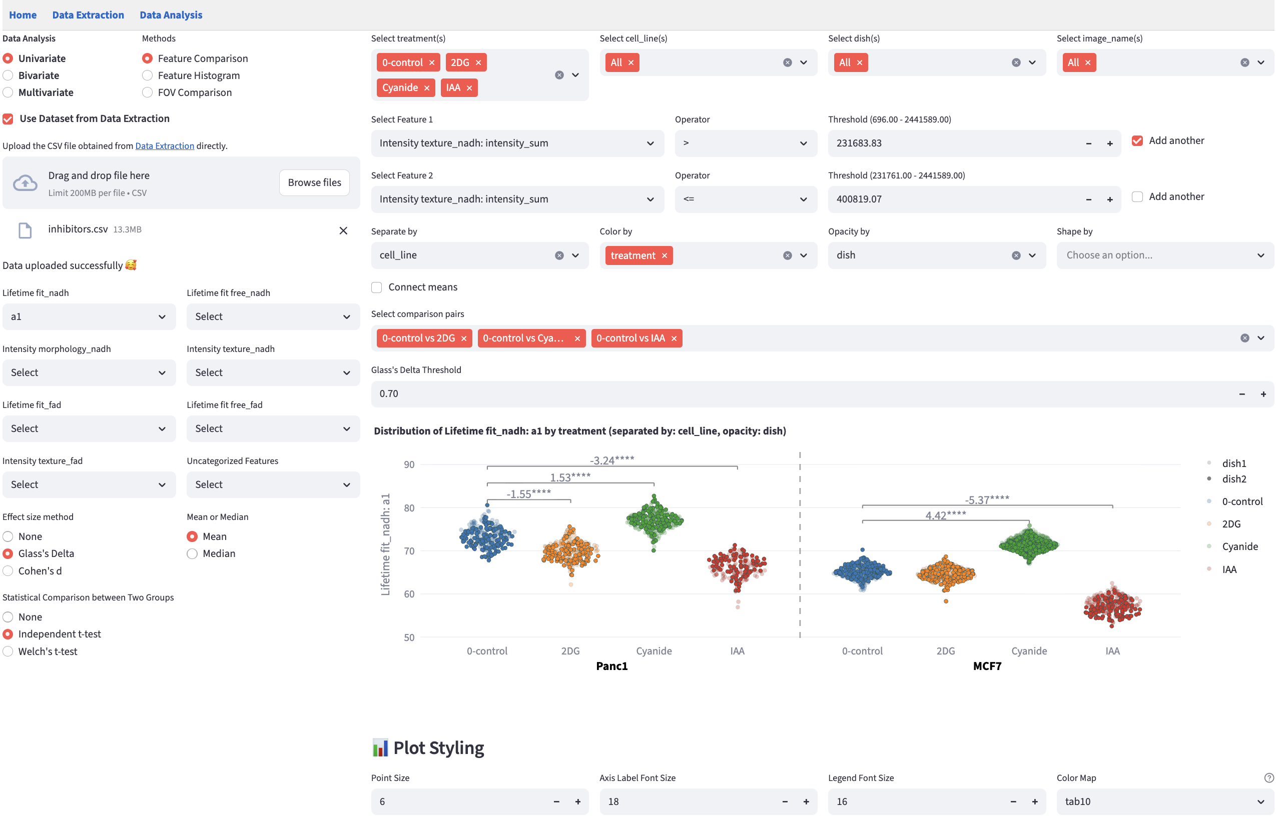
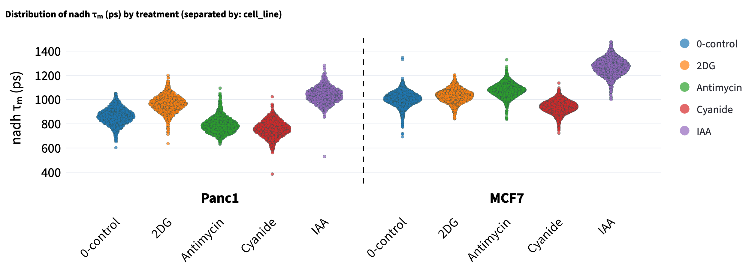
Separate by takes effect before Color by. Separate by divides the plot into sections separated by a dashed line, with each section labeled by one of the available categories of the selected categorical feature after filtering. The selected feature of Separate by is automatically removed from available features in Color by. The section order is determined by the order of the categories which are sorted numeric-alphabetically.
Point encodings and comparisons are then applied within each section. For example, select cell_line in Separate by and treatment in Color by to compare treatments separately for each cell line. Treatment colors stay consistent across sections. Effect sizes are calculated within each section, with annotations limited by the selected pairs and effect size threshold.
If Separate by is left blank and both cell_line and treatment are selected in Color by, then colors are assigned to each cell line and treatment combination, and effect sizes are calculated across all combinations of group pairs (again, only pairs at or above the effect size threshold are shown).
16.5 Subcolor by
Color by gives one color per x-axis group, which leaves no way to ask where the points within a group came from. If each treatment pools three donors, a shift between treatments may be a real effect, or it may be one donor sitting away from the other two. Subcolor by answers that.
Select Subcolor in the Opacity | Subcolor | Shape selector, then choose a categorical column in the picker below it. Color by is relabeled Group by: it continues to define the x-axis groups, while the subcolor column supplies point colors. Switching to Opacity or Shape keeps the selected column when it remains available, but applies only the new encoding. Clear the column to turn the encoding off.
Only the paint changes: x positions, tick labels, the boxplot and mean connector, effect sizes, statistical tests, and comparison pairs all stay on the Group by groups. The color map is global, one color per value across the whole figure, so a donor appearing under three treatments is the same color in all three, gets a single legend entry, and toggles everywhere at once. With the group count toggle on, its n is likewise the figure-wide count.
The picker offers categorical features with more than one category after filtering, except the Separate by feature, and is disabled while Group by is empty. A grouping column can also supply the point encoding. To give each collapsed category a consistent color across treatments, choose the same categorical column in Collapse by and Subcolor. Missing values form an N/A level with a color of its own rather than being dropped.
Subcolors are generated rather than sliced out of the colormap: cyclic palettes put their first and last entries at neighboring hues, and qualitative ones such as tab10 repeat once you ask for more colors than they hold. The colormap’s first color seeds a palette of exactly the size needed, built in OKLCH so the members read as a family — hue confined to an arc around the seed, lightness stepping outward for separation. Candidates are scored composited over the background at the opacity points are drawn with, since two semi-transparent colors that differ in RGB can look the same on screen. The result is deterministic, so the exported script matches the app.
Subcolor by is for a small nested feature, roughly 2–5 values. Past about 7, no palette lets a reader assign a point to a value; use Separate by or a filter instead.
16.6 Reorder X-axis Groups
Groups are ordered numeric-alphabetically by default, which puts the control wherever its name happens to sort. The Reorder X-axis Groups checkbox below the plot opens a drag-and-drop list; rearrange it and press Confirm Reordering.

The order is applied before comparison pairs are formed, and each pair runs left to right, so the leftmost member is the one Glass’s Delta treats as the control. Reordering is how you tell FLIM Playground which group that is.
- It reorders the
Color by/Group bygroups only.Separate bysections keep their default order, and one group order is shared by every section. - It is stored per (numerical feature,
Color by,Separate by) combination. Groups you did not move keep their relative order, and groups that turn up later are appended rather than resetting your arrangement. - It is carried into the exported script as
CUSTOM_ORDER.
16.7 Comparison Widget
Statistical tests and effect size calculations are performed on the selected comparison pairs. FLIM Playground uses the groups on the x-axis populated by Color by — labeled Group by when Subcolor by is on — to create comparison groups, starting from the leftmost group. Pairs are formed after any custom x-axis order is applied. For example, if there are 5 groups, then \(\binom{5}{2} = 10\) comparisons will be created. The number of groups can get combinatorially large and many of the comparisons are not meaningful. Therefore, two widgets are provided to filter the comparison groups:
A selection widget that shows all possible comparisons by default and users can deselect groups they do not need.
A threshold widget that filters out comparisons whose effect size falls below the threshold.
16.7.1 Effect Size Threshold
The threshold widget is rendered per effect size method, and the two do not share a default:
| Effect size method | Default | Step | Range |
|---|---|---|---|
| Glass’s Delta | 0.7 | 0.05 | 0–3 |
| Absolute Cohen’s d | 0.5 | 0.1 | 0–3 |
A pair is kept when the absolute effect size is greater than or equal to the threshold, so a large negative Glass’s Delta is not dropped for being negative; 0 keeps every selected pair. Each threshold is remembered per numerical feature. Under Separate by, one threshold and one pair selection govern every section.
16.8 Effect Size
Complementary to statistical tests, which address “is there a difference?”, effect size metrics answer “how large is the difference?”, enabling cross-study comparison. FLIM Playground offers two effect size calculation methods, Glass’s Delta and Absolute Cohen’s d, each can be in mean or median form.
16.8.1 Glass’s Delta
Mean (\(\bar{X}\)) form: \[ \Delta_G = \frac{\bar{X}_{\text{treatment}} - \bar{X}_{\text{control}}} {s_{\text{control}}},\qquad s_{\text{control}} = \sqrt{\frac{1}{\,n_c-1\,}\sum_{i=1}^{n_c} \bigl(X_{control_i}-\bar{X}_{\text{control}}\bigr)^{2}} \]
Median (\(\tilde{X}\)) form: \[ \widetilde{\Delta}_G = \frac{\tilde{X}_{\text{treatment}} - \tilde{X}_{\text{control}}} {\operatorname{MAD}_{\text{control}}},\qquad \operatorname{MAD}_{\text{control}} = 1.4826 \times \operatorname{median}\,\bigl\lvert X_{control_i}-\tilde{X}_{\text{control}} \bigr\rvert, \qquad i = 1, \ldots, n_c \]
\(\operatorname{MAD}\) stands for median absolute deviation. In order to make \(\operatorname{MAD}\) asymptotically consistent with the standard deviation under normality, it is scaled by \(C = 1 / \Phi^{-1}(0.75) \approx 1.4826\). Implementation-wise, it uses median_abs_deviation from scipy.stats, and scale option is set to "normal" to account for the constant multiplier \(C\). THE MEDIAN FORM of both Glass’s Delta and Absolute Cohen’s d IS NOT REPORTED IN THE LITERATURE.
Which group is treatment and which is control matters! From the formula of \(\Delta_G\), switching the order not only flips the sign of the result, but also changes the denominator, which is \({s_{\text{control}}}\), the standard deviation of the control. FLIM Playground treats the group on the left as control and the group on the right as treatment. Use the custom x-axis order to place the control on the left. Absolute Cohen’s d does not assume a treatment-control structure.
16.8.2 Absolute Cohen’s d
Mean (\(\bar{X}\)) form:
\[ |d| = \left\lvert\frac{\bar{X}_{1}-\bar{X}_{2}} {s_p}\right\rvert,\qquad s_p = \sqrt{\frac{(n_1-1)s_1^{2} + (n_2-1)s_2^{2}} {n_1 + n_2 - 2}} \]
Median (\(\tilde{X}\)) form:
\[ |\tilde{d}| = \left\lvert\frac{\tilde{X}_{1}-\tilde{X}_{2}} {s_{\tilde{p}}}\right\rvert,\qquad s_{\tilde{p}} = \sqrt{\frac{(n_1-1)\operatorname{MAD}_{1}^{2} + (n_2-1)\operatorname{MAD}_{2}^{2}} {n_1 + n_2 - 2}} \]
16.9 Statistical Test
Statistical tests are performed on the selected comparison pairs that meet the effect size threshold (if users choose to calculate effect sizes). The statistical tests supported are:
- Independent t-test (student’s t-test, for equal variances)
- Welch’s t-test (for unequal variances)
FLIM Playground uses scipy.stats.ttest_ind to perform the independent t-test and scipy.stats.ttest_ind with equal_var=False to perform the Welch’s t-test.
With Collapse by, sample sizes count the category means in each comparison group. The app reports when a selected comparison has too few points for a statistic; adding observations to an existing category can change its mean but does not add another point.
P-values are summarized with significance asterisks: if \(p \leq 0.0001\), four asterisks (****) are shown; otherwise if \(p \leq 0.001\), three (***); otherwise if \(p \leq 0.01\), two (**); otherwise if \(p \leq 0.05\), one (*). Values with \(p > 0.05\) are not given a significance asterisk marker in this convention.
16.10 Comparison Annotation
Eligible comparisons are annotated with brackets above the points and existing annotations. The annotation combines the numeric effect size with significance asterisks when both are available; it does not display a numeric p-value. For example:
1.23**shows an effect size of 1.23 with \(p \leq 0.01\).**shows significance when only a statistical test is selected.Δ=1.23shows an effect size without significance asterisks, including when the selected test has \(p > 0.05\).